Research
KlimEd
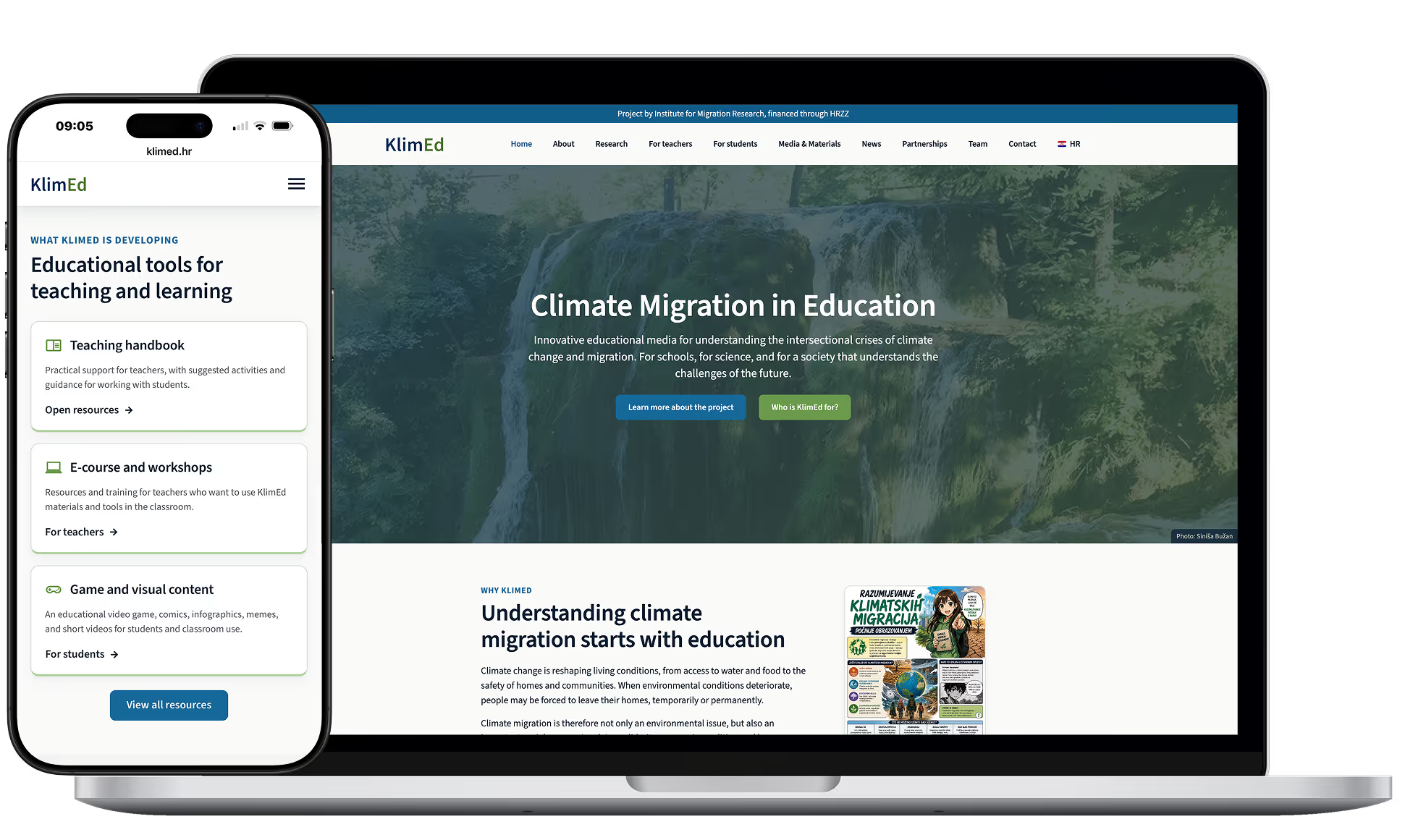
A bilingual site that makes a three year research programme easy to navigate.
Delivered
Bilingual websiteInformation architectureResearcher profilesMaterials libraryDesign system
Built with
WordPressElementor

Research
A bilingual site that makes a three year research programme easy to navigate.
The problem
KlimEd is a three year research programme on climate change and migration, funded by the Croatian Science Foundation and led by the Institute for Migration Research. It had project context, proposed content, audience definitions, and institutional requirements, all approved. What it did not have was anything the public could read.
The hard part was never the volume. It was turning a multi year research programme into a clear website that works in two languages, holds full researcher profiles, publishes materials and news for years, and meets what the public sector expects of a nationally funded project.
It also had to stay a practical WordPress build, because the people running it after launch are researchers, not developers.
What I built
Two languages, built by hand
Croatian and English were implemented manually rather than through a translation plugin, so structure and layout stay under control as the project grows.
A homepage that sends people somewhere
The homepage introduces the project and sends teachers, students, researchers, institutions, and the public toward the section meant for them, with the latest updates surfaced underneath.
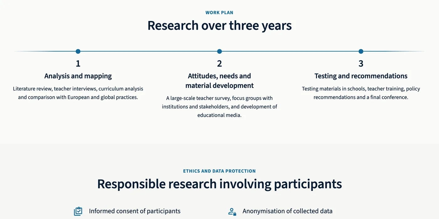
Academic material turned into readable pages
Long research and planning material was rebuilt as sections, cards, timelines, and structured blocks that keep the approved meaning but can actually be scanned.
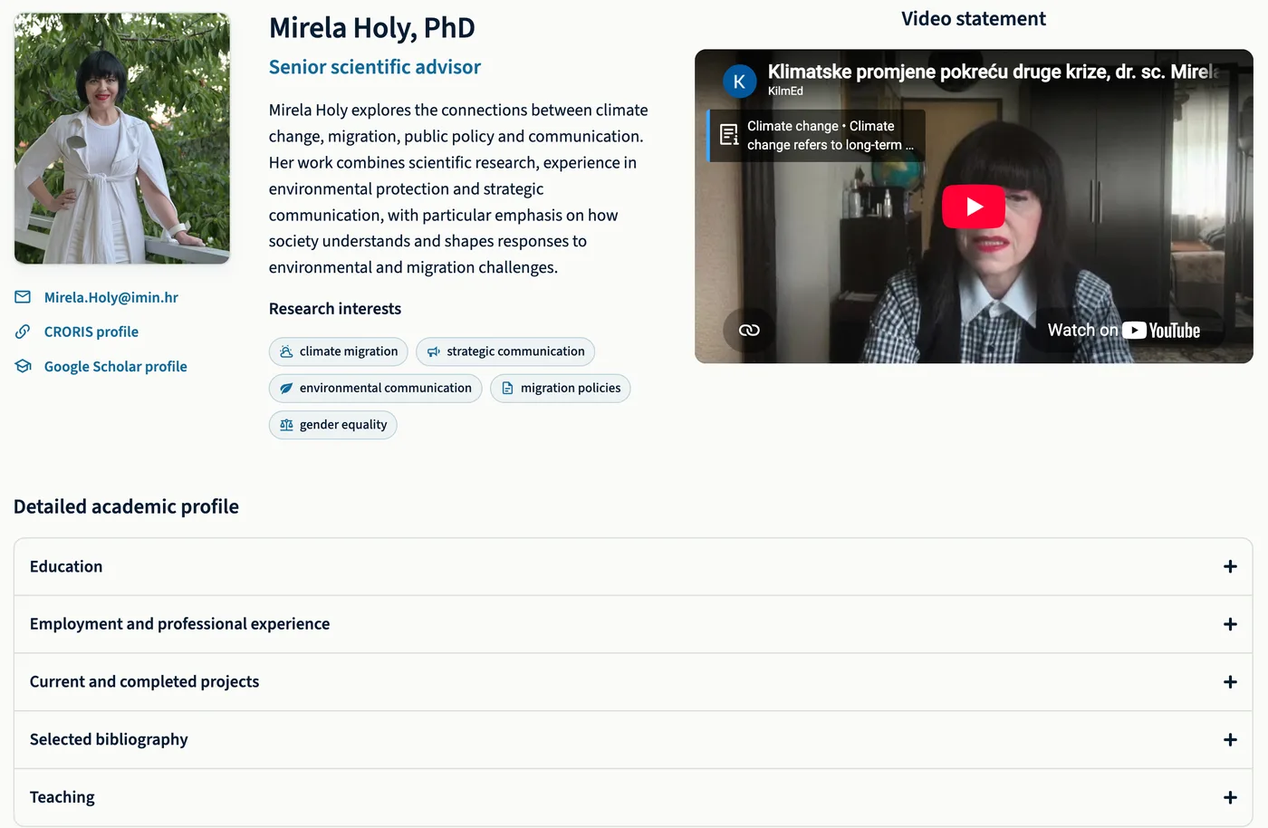
The research team, properly presented
Every profile carries a photo, role, biography, scientific interests, and contact and academic links, with expandable detail covering education, employment, projects, and selected bibliography. The project lead comes first.
Materials and news the team runs itself
Project outputs are added once and appear by type, from infographics to policy briefs to reports. News posts surface on the homepage and drop into an archive styled to match the site rather than a default blog.
Before and after
Before
A project the public could not read
After
A project anyone can follow
Results
What the project got
A complex project, made navigable
The approved material is all still there, restructured so it can be scanned rather than read end to end.
Every audience has a way in
Each audience gets its own route from the homepage instead of one undifferentiated wall of project material.
The team publishes without calling anyone
Hosting, backups, and client accounts were set up and handed over with the site, so routine updates stay in house.
Built to institutional standards
Privacy and cookie policies, an accessibility statement, an impressum, and a custom 404 page went in as part of the public structure.
We are very satisfied with the final appearance and functionality of the project website. It presents the KlimEd project and its goals in a clear, modern and well-structured way, and allows easy orientation and quick access to information. The website is adapted for display on mobile devices and fully follows contemporary standards of web design and accessibility.
If what you do is hard to explain on a website, visitors leave before they get it. Start with a free path review.
Next case study
Adonis Pharma