By using this site, you agree to our privacy practices and help us improve your experience.

Distribution

Adonis Pharma

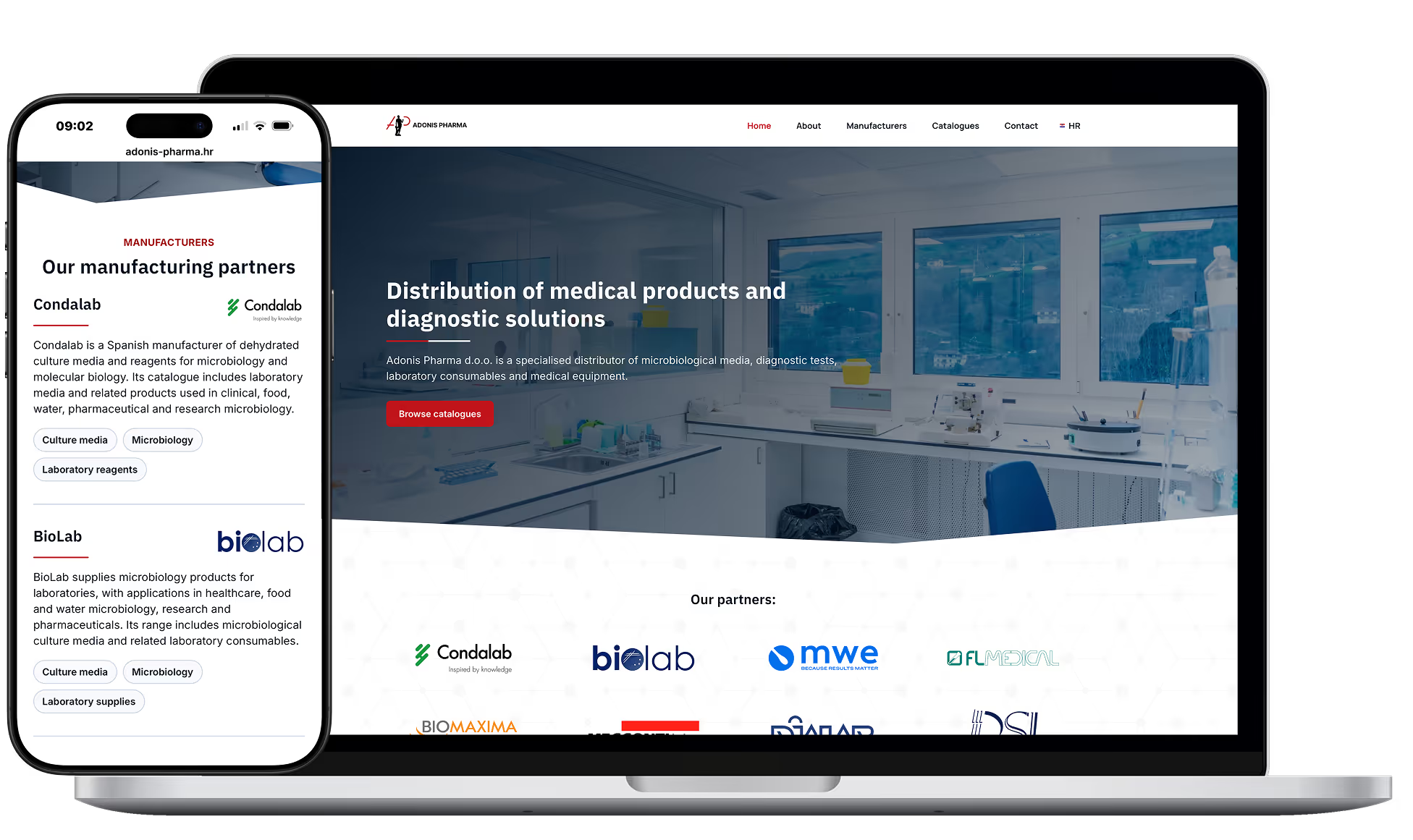
A modern bilingual catalogue site that presents the company properly and makes every catalogue easy to find.

Adonis Pharma project preview
Delivered
Bilingual websiteVisual designCatalogue libraryManufacturer presentationQuality policy section
Built with
WordPressElementor

The problem

Vendors judging a distribution partner were landing on a thin website

Adonis Pharma had outgrown its website. The business had matured into a serious distributor of medical and diagnostic products, and the site had not moved with it.

What was there was a limited homepage, some supplier logos, footer content, and navigation that led to pages which were never fully built. It did not communicate the offer, the product categories, the manufacturers behind them, or the quality positioning the company runs on.

The director was clear about what he wanted. A modern website that looks serious and represents the company properly. That mattered most in front of one audience, the vendors and suppliers deciding whether to appoint Adonis Pharma as a distribution partner.


What I built

A bilingual site that carries everything a vendor checks

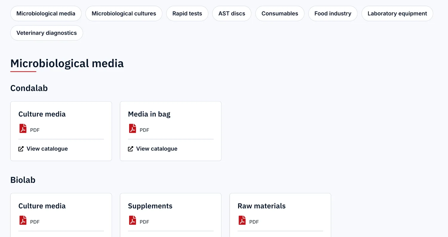
Adonis Pharma catalogue page with category navigation and catalogues grouped by supplier
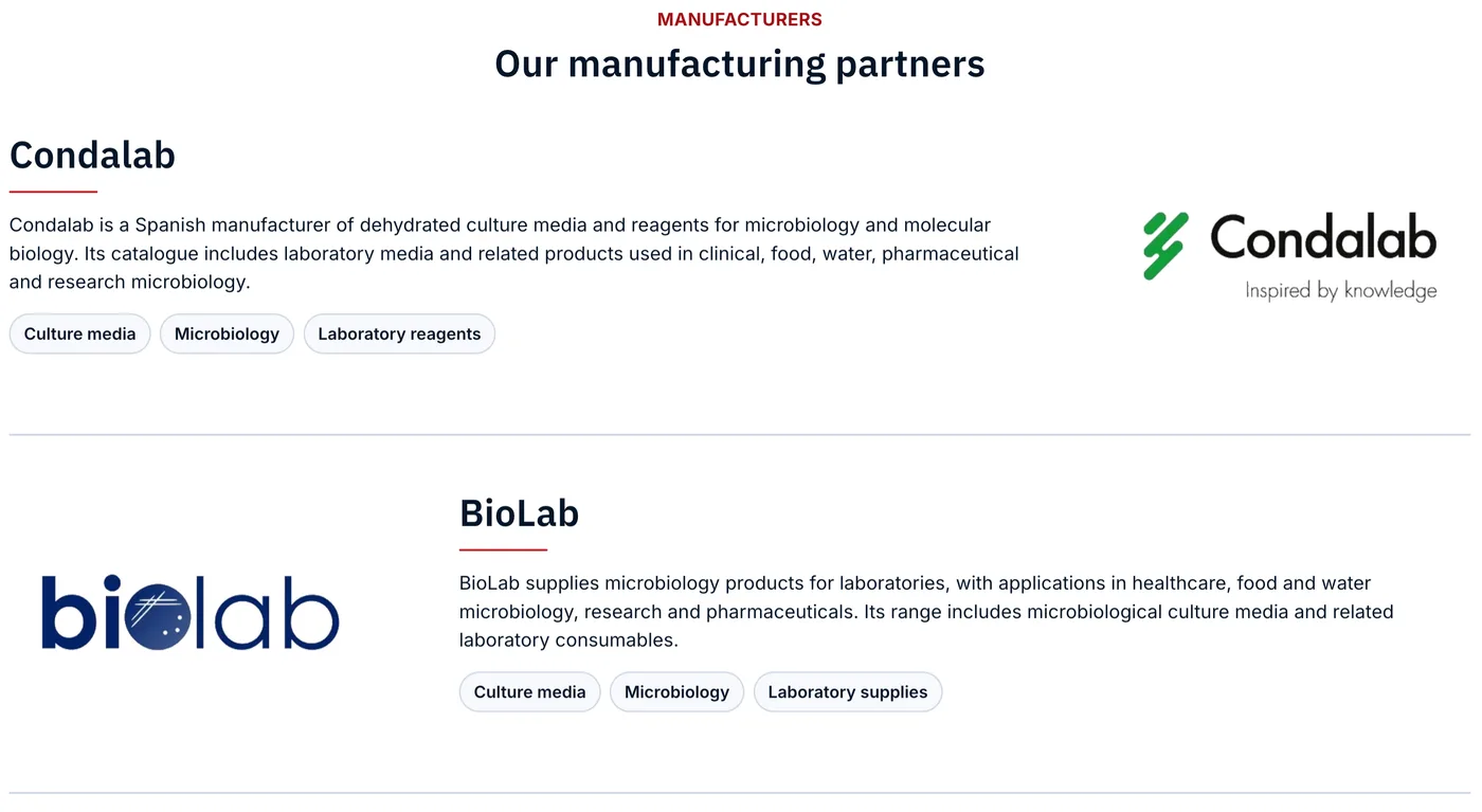
Adonis Pharma manufacturers page presenting suppliers with logos, descriptions, and category tags
  • A modern look, built to be taken seriously

    A custom visual system was designed around the company's own brand, using a navy, grey, and white palette with a red accent lifted from the logo, plus a signature lined background pattern.

  • Two languages, built page by page

    Croatian and English were built page by page, not run through a translation plugin.

  • A catalogue library instead of scattered files

    Catalogues are grouped by product category and then by supplier, across microbiological media and cultures, rapid tests, AST discs, consumables, food industry, laboratory equipment, and veterinary diagnostics. Each sits on its own card, labelled as a PDF, one action from open and compressed so it does not stall.

  • The supplier network, made visible

    A Manufacturers page presents the suppliers with logos, a description of what each one makes, and the categories they cover. A supplier strip on the homepage puts that partner network in front of visitors early.

  • Quality positioning made public

    The ISO 9001 based quality policy became a full bilingual section of the site, covering compliance, customer needs, risk management, and continuous improvement, instead of sitting in an internal document.

Before and after

What changed for someone evaluating the company

Before

A site thinner than the business

  • A limited homepage
  • Navigation into half-built pages
  • Catalogues hard to find
  • Suppliers barely presented
  • Quality policy in an internal document

After

A site a vendor can evaluate

  • A homepage that introduces the business
  • Catalogues grouped by category and supplier
  • Every catalogue labelled and one click open
  • Manufacturers with logos and detail
  • Quality policy as a public section

Results

The website now shows the whole business

What the site does now

8 categories
catalogues grouped by supplier, one click from open
Vendor ready
a site that matches the business behind it
  • The company looks like the distributor it became

    A modern, deliberately restrained design system carries the whole site, so a vendor's first impression finally matches the business behind it.

  • A catalogue, not a webshop

    Structured PDF discovery was the real need, so the build went to grouping and navigation rather than product-level filtering or a shop.

  • Vendors see the partner network

    Credibility appears before a visitor goes looking for it, on the homepage supplier strip and again on the Manufacturers page.

  • Enquiries reach the right place

    A contact form captures name, organisation, email, phone, enquiry type, and message with data-processing consent, and sends straight to the company address.

See what your own site says about your business

If the people deciding whether to work with you are judging from a thin website, they are judging the wrong thing. Start with a free path review.

Next case study

Preelook Apartments